
Choosing the Perfect Wedding Color Palette
September 5, 2020
Oooo I LOVE talking about color palettes. This blog is literally taking me back to high school art class. A ton of my clients come to me and usually are at a roadblock when it comes to choosing their palette. So I will show you- 1.) Which color palette speaks more to you and your personality & 2.) How to pick the palette that will blend perfectly together!
Which Color Palette Speaks More to You & Your Personality
First let’s dive into what exactly the big deal is with color palettes and why everyone and their momma always asks you when you are planning a wedding. Color palettes are super important. The reason being is because usually everything else within your wedding revolves around it. Whether it be your bridesmaids dresses, wedding flowers, cake, linens, etc!
The advice I give my clients is if their wedding date is in a specific season, have a color palette that is the opposite of that season. What the heck does that mean??- you may ask! Well for example, if you are getting married in spring, everything is so bright and airy anyways, so I suggest for them to go with a more ‘subdue’ color palette. Subdue colors can mean a muddy tone, not as bright, and something very soft on the eyes. When a bride is wanting a fall wedding, I suggest going with tones that catch the eye and pop!

How to Pick the Palette that will Blend Perfectly Together
Now to talk about the color wheel. We all know what that is! But some of us might be unfamiliar with the Analogous Color Wheel. Analogous is when you look at a color wheel and it is the 3 colors that are right next to each other. Using those three colors throughout your big day will have everything blending together perfectly.
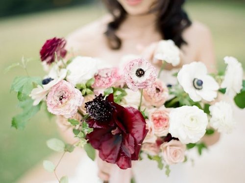
When you have two colors you want to use, you can also ‘bridge the gap’ by using a color that would be an in between color of those two. For example, If you are using a red but also want an ivory color, use a pink to bridge that gap. One of my favorite Aussie floral designers, Cara Fich is super good at demonstrating this. See below!

As you can see, there are darker blooms, white or ivory blooms, and then shades of pink that bridge that gap. This also makes the eyes wonder and also focus on how amazing they all blend together. Also, if a bride is a more ‘romantic bride’, I would highly suggest a color palette like this. SUPERRRR ROMANTIC!! If you are hung up on which color would be the best to ‘bridge the gap’ always ask your floral designer what his/her perspective is! I know you have been peeing your pants, waiting to see which color palette would be perfect for you and your big day!- so let’s head on over to which one it would be!
Need more help choosing your color palette and all the other details for your big day? I would love to make it look like a complete dream! Check out my experience page to learn more.
